It’s been 44 years since the Museum opened. In those four decades, it’s expanded from a small, brick building to the largest cultural institution within a 150-mile radius. Its collection has grown from 1,000 items—mostly from the Americas—to over 30,000 objects from six different continents. However, the Museum isn’t just a passive, cultural repository. On average, nearly 20,000 people connect with the Museum through its programs and exhibits each year. Thousands more interact with its online content each month. In the words of one guest, “[there are] no dusty exhibits here…instead [it’s] a beehive of educational activities.” Overall attendance is expected to exceed previous levels after construction is complete.
In light of that, senior-level staff decided to reassess the Museum’s position in the community. In short, what does the community want from the Museum? What does the staff want to do for the community? What additional services can the Museum provide? What parts of our brand are outdated? What part of our mission needs to be re-emphasized?

a lively, vibrant home for the world’s artistic heritage
The first thing that we decided to rework was the logo. We believe the new look better matches what the Museum has become since 1998: a lively, vibrant home for the world’s artistic heritage. That being said, we loved the old logo and know that many felt the same. So, we want to walk everyone through the changes.
The previous logo was created in 1998 and was based on a reoccurring Mississippian sun motif. It was distinctive, memorable, and accurately reflected the Museum’s regional focus. However, it wasn’t versatile or simple. To make matters worse, the internet really took off after we made the logo! Unfortunately, it looks downright terrible on most modern screens—particularly cell phones. So, we asked creative director/designer Paul Yih to redesign our logo.
After reviewing our website, social media feeds, and publications, Yih sent us several different concepts. At first, we asked him to simply revise the old logo. However, it became clear that a modern interpretation of the motif would come across as silly and frankly, insulting. Moreover, it was too regionally specific. The Museum had gone global since 1998!
Sun Worship and Mesoamerican Pyramids
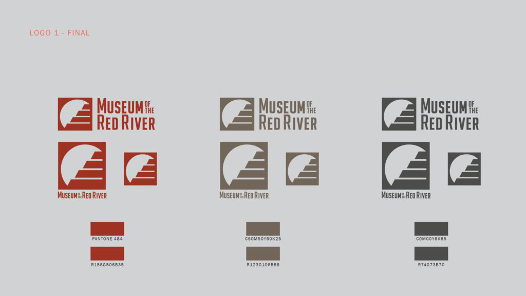
Still, we needed to keep some part of the old logo intact. So, we asked Paul to incorporate some sort of sun motif into the new logo. Solar worship played a significant role in most native cultures, and most of our collections are from native cultures. It made sense from a curatorial and branding perspective. That being said, we couldn’t just have a sun as a logo. (We’re not the Museum of the Sun!) We needed something that accurately reflected our commitment to preserving the world’s artistic heritage, while emphasizing the contributions made by native American groups. We also needed something unique.
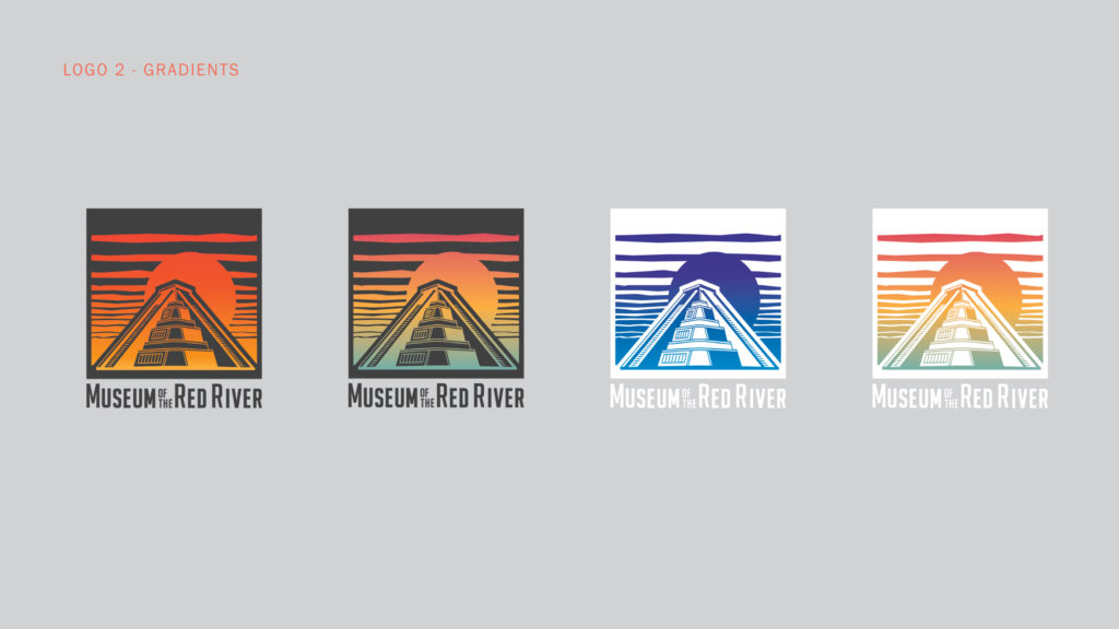
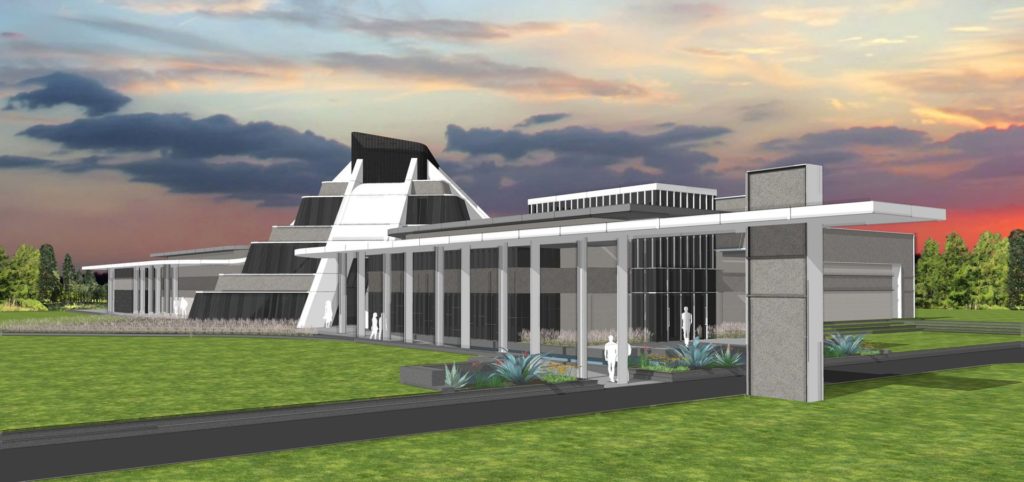
We decided to go with something only we have—a glass pyramid. The new “face” of the Museum is based on Mesoamerican pyramids—specifically El Castillo at Chichen Itza and the Pyramid of the Sun in Teotihuacán. Its presence on the logo highlights the Museum’s regional focus—the Americas. However, when combined with the sun, it emphasizes the global nature of the collection. (As one person noted, much like the former British empire, the sun never sets on the Museum’s collection.)

We know this is a major departure from our original logo. So, we asked Paul to create a secondary, stylized version for all our merchandise and the Programs Department. It’s closer to our original logo and looks fantastic on water bottles, hoodies, etc. You can find the primary logo on the remainder of our public-facing content.
Ultimately, this change is just a glimpse of things to come in 2019 and 2020. As always, we welcome your feedback and thank you for your support!

